May I Have Your Attention? – Tip #35

Selecting the right image is essential in capturing the attention of community members. Whether an actual photo, conceptual image, or descriptive graphic, the image should quickly convey your topic and set the stage for your reader. A targeted, memorable image will allow quick recognition if they wish to return to the article.
Image Content
We recommend you refrain from using an image containing text, particularly if it is in the lower left quadrant where the post’s title and subtitle will overlay it, looking cluttered, too busy, and unappealing. Another reason to avoid displaying text within the image is that it may not scale as desired across various devices.
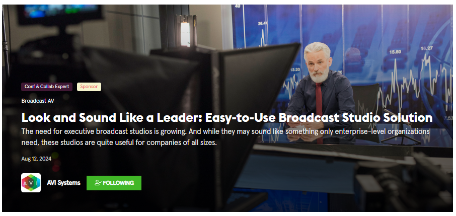
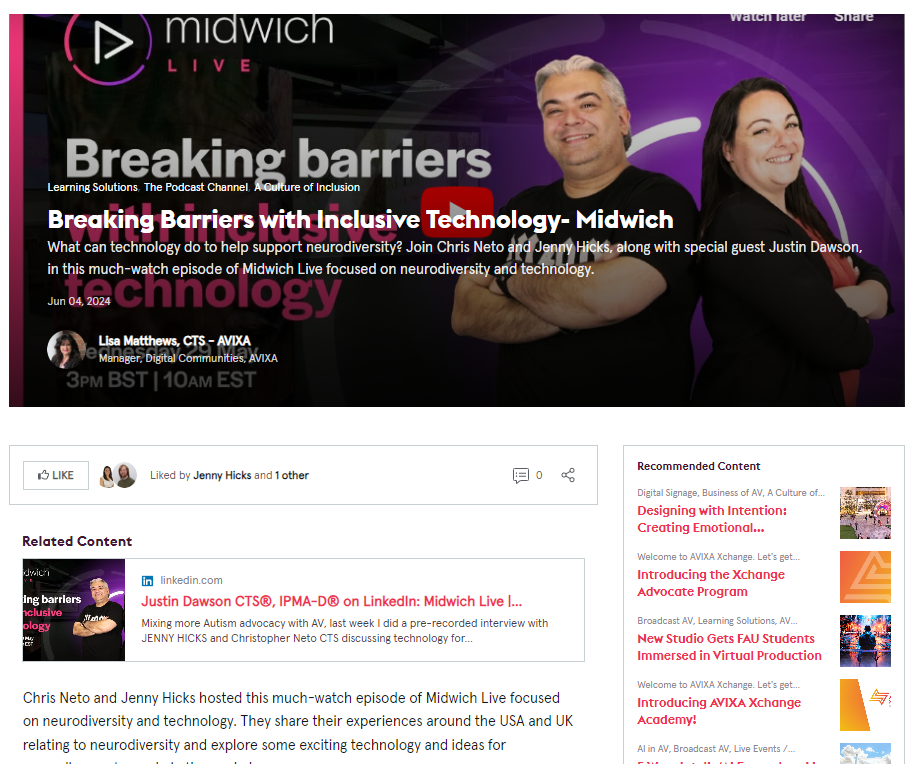
Here are some examples. You’ll note that when viewed in a Room or Channel as a Tile, the post’s title does not display on top of your image however, once opened, or when displayed in Xchange’s home page carousel*, the title, subtitle, date, author and room/channel designations all display as an overlay.
Poster Image displayed as a Channel or Room tile:

Poster image as displayed when the post is viewed:
*Pro Tip: Exposure in the carousel will boost your content views! In addition to any sponsored content, AVIXA editors select content to feature in the carousel based on topic, quality, and visual appeal so be sure to include an effective, eye-catching image free of clutter.
Contrast & Orientation
Remember that the overlaying text is white, so choosing a deep, contrasting shade will help your article’s title stand out. If possible, place your image’s subject on the right side so as not to compete with the title text.
Here are some great examples:


Image Size & Optimization
Poster images should be at least 1280 x 960 pixels. The image can be either a JPG or PNG (GIFs are also accepted) in a landscape orientation (horizontal).
Optimization techniques apply to images as they are indexed by search engines and affect page load speed. Reduce pictures as needed to no larger than 120kb, maintaining its proportions. This will provide a good user experience with images loading smoothly. Include keyword-rich text in the image’s filename and image ALT text.
Show Us What You've Got!
So, take a moment to scan through your favorite channels and rooms. Which posts catch your eye? What do they have in common? Will your poster image effectively represent your content and your brand? Will it successfully garner views and, hopefully, get featured in the community carousel?
Let us know if we can help!


Please sign in or register for FREE
If you are a registered user on AVIXA Xchange, please sign in