Digital menu board content strategy – keep it simple, clean and straightforward!

I will start with this quote by Shane Meendering “Bad design shouts at you. Good design is the silent seller.”
Creativity has no limits but what happens when creativity amplifies things while trying to be different? It could work great for some industries while it could completely mess things up for others.
My job today is to simplify the content strategy dilemma for the restaurant industry. When it comes to serving food, we feel visuals need to connect with your audience subtly but with the ‘wow factor’
I would like to share my experience on this to give you all a better idea.
I have been a food lover since I can remember. I never miss a chance to try out new places. After a long tiring day at my workplace, I decided to give this new joint a visit and check it out.
It was a pizza joint, so I hope to find some unique options. To my amazement, they displayed the combo options only. What disappointed me is that they assumed only people in groups would be coming in to place combo orders.
What if someone like me wanted to try out their pizza options and not combos?
They did have some great pizza options too. It was not until after talking to the staff there that I found out about them.
The pizzas were great, but they have possibly lost a lot of potential customers simply because they focused only on the combos instead of the entire menu. A failed opportunity in my eyes.
Sure, their combos sold more but individual pizzas also had a lot to offer.
I never visited that place again let alone recommend it to anyone. But this is not just one place. I have seen several amazing food joints mess things up simply by not using digital menu boards efficiently.
One could assume they were following the traditional suite of luring customers with combo deals but hey, you need to create a brand standing that not just resonates with one thing.
My takeaway from this - focus on customer experience, not just sales!

If you are looking for more repeat customers, make sure that your prime focus as a restaurant is customer experience. Increased sales are going to be the outcome of a seamless customer experience.
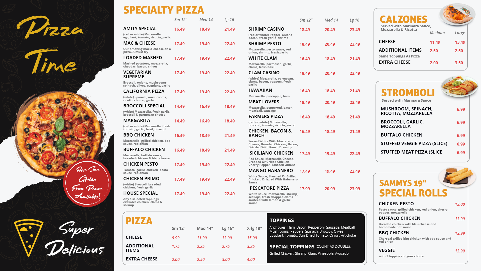
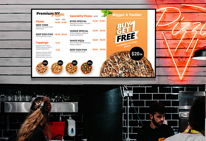
A good digital menu boards will rely on a lot of things like the color choice, the font choice, the menu item choice, the food images used and much more.
If only high-ticket items are shown on the menu screens, the repeat customer ratio will definitely not be that good. Your restaurant needs to be a place where everyone can eat.
Quick tips on designing the digital menu boards:

- Make sure their design is simple and readable
- Follow the same design structure and fonts throughout your menu unless the current one is damaging your sales. Consistency is the key.
- Know your target audience – their age group and preferences and give your menu a look that resonates with them
- Test your menu templates, get feedback and refine to the extent you can
- Try not to fit in all the menu items in one template if you have a long menu
- Leverage on the power of videos and images
- Dedicate a separate screen for new menu items or offers you are running
- Make sure to update the items that are out of stock
- The design should go well with your logo and brand colors
- Keep a section of your menu specials and combos but do not ignore other menu items too
This is not just limited to restaurants though. Digital signage are used across several ranges of industries for different purposes and often it is the case that they are not used optimally or at least not displaying the right content at the right time.
I had a similar experience at a healthcare center. It is spread across a huge area, with three buildings for different departments. Ideally in a scenario like this, when you enter space, there should be a wayfinding guide, so a new visitor knows where to go.
Instead, they had a slideshow and video showing more about the healthcare center. This could have been a better idea for the content inside departmental areas in the center.
When I entered the location for the first time, I had to go back to the reception area twice before I could figure out where I had to go. Though that’s the story for another day, the point is with wrong content, digital signages are a lost opportunity.
How can DotSignage help you get your digital menu board design and content right?
DotSignage is a cloud-based digital signage software solution designed to help you manage content on your remotely placed screens with ease.
It has been ruling the digital menu board world for the past couple of years and this has been possible through the fair share of amazing features and intelligently designed elegant looking menu board templates.
There are around 500 menu board templates today to choose from. They have been systematically categorized for you to filter out and choose one of your likings.
The digital signage template editor of the solution gives you complete freedom to design the kind of template that you have thought of. With 1000+ stock images, the option to add QR codes, change the background image, add menus, text or shapes of your choice.
You also get to upload your own images while designing or editing your template.
Adding to that, you can create interesting slideshows with images and videos, schedule different content for different times of the day, use several news apps or weather apps to keep your customers engaged while dining.
Conclusion
The sole purpose of creating digital menu boards is to make things easier and quicker for customers. If you go to a restaurant and they fail to make things simpler for you, it's no use.
In the process of making things appealing, restaurants miss out on the very essence of what they want to offer. A fancy-looking menu board that does not look easy to read is of no use.


Please sign in or register for FREE
If you are a registered user on AVIXA Xchange, please sign in
@Mitesh Patel, thanks for sharing your expertise - you are spot on. I can't tell you how many times I've walked up to a counter, looked up, and just didn't know where to start. That user experience is everything! If I can't find something quickly, I feel as though I'm holding up the line and just order "whatever". I'm generally unhappy with my choice and, yes, it's unlikely I'll return. Knowing your audience and keeping the signage clear and easy to read (including a font size that can be read from the other side of the counter), are so important! Great points!
Thank You for sharing your thoughts!